Naco Taco
NacoTaco was founded with the vision of becoming Hanoi’s first authentic Mexican restaurant, setting itself apart from the fusion and Tex-Mex concepts prevalent in the city. To achieve this, the brand adopted a bold, minimalist aesthetic that reflects its commitment to authenticity. By focusing on traditional Mexican ingredients and recipes, NacoTaco delivers a genuine taste of Mexico while creating a unique and memorable dining experience.
Task
Build a reputation for quality, authenticity, and consistency through a bold, minimalist brand identity.


| Accent #00A551 |
SCSS var $color |
◯ |
| R 0 G 165 B 81 |
Green
| Accent #ED1C24 |
SCSS var $color |
◯ |
| R 237 G 28 B 36 |
Red
| Primary #FFFFFF |
SCSS var $color |
◯ |
| R 255 G 255 B 255 |
White
| Primary #000000 |
SCSS var $color |
◯ |
| R 0 G 0 B 0 |
Solid Black
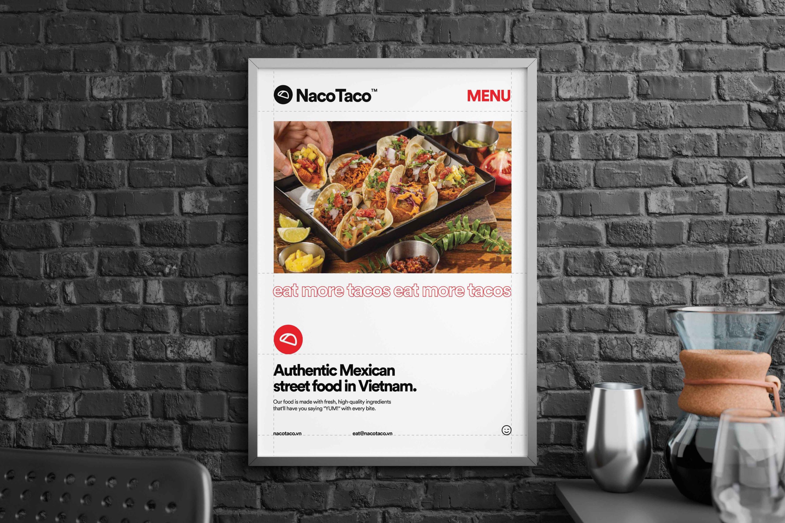
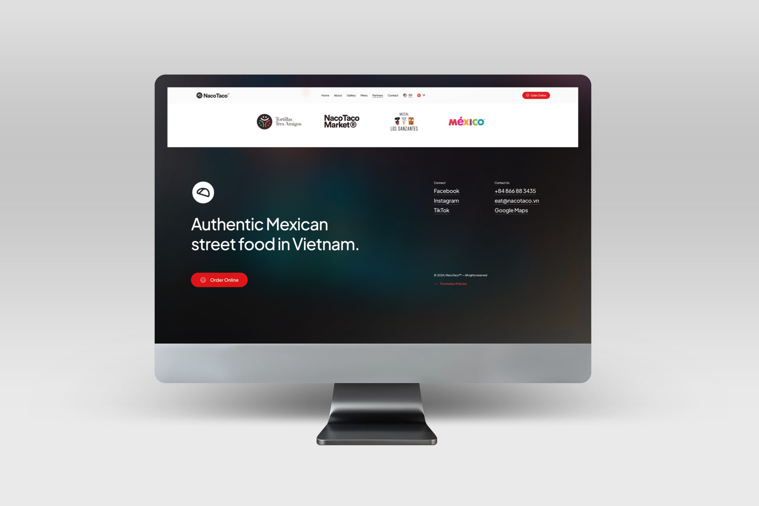
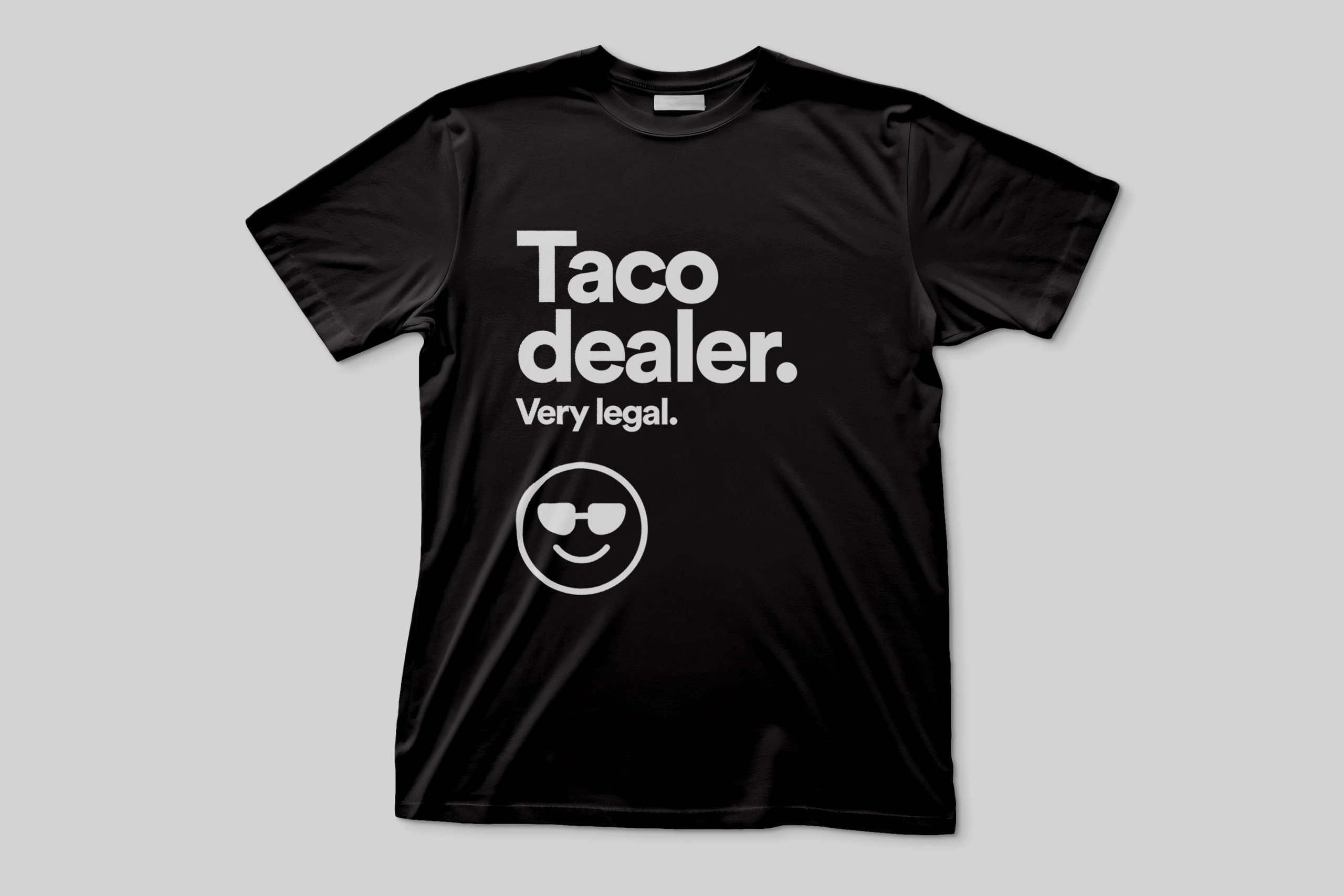
The color palette for Naco Taco was carefully crafted to reflect the brand’s vibrant, authentic, and approachable identity, seamlessly blending tradition with a modern touch. The bold and energetic tones evoke the essence of Mexican culture, capturing the warmth, passion, and joy that define the dining experience. The palette draws inspiration from the vibrant hues of fresh ingredients and the rich culinary heritage of Mexico, creating an immediate emotional connection with the audience.
The combination of lively reds and whites, balanced with a grounding green and a sophisticated black, conveys freshness, quality, and a contemporary edge. This thoughtful blend ensures the brand stands out in a competitive market while maintaining its commitment to authenticity and flavor. The versatility of the palette allows it to shine across both digital and physical applications, creating a cohesive and memorable visual identity that resonates with the modern consumer.

